
Welcome to the future; one without distracting windows and menu bars. The RealPhone is an experiment in user interface design for a new, real-world user interface style...
So begins the IBM's literature on their experimental RealPhone application. Once we read this, we just knew we'd be creating a new chapter in the Interface Hall of Shame. Real-world metaphors have been attempted in the past, and have almost always met with failure. In this section, we take an in-depth look at the new interface, and attempt to illustrate why real-world metaphors rarely live up to their expectations.
Last updated 21-January-1997
| The Hype | Our User-Centric View |
|---|---|
| Welcome to the future; one without distracting windows and menu bars. |
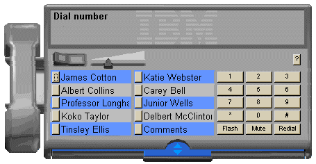
A Windows-based application without windows? Windows are used to separate tasks into manageable sections. You might have a word processor running in one window, and a spreadsheet application in another. A windows-based application without windows is analogous to a paper-based task without paper. Similarly, we've found that menus are a valuable learning tool for new users. They organize the many functions of an application into distinct categories, thus serving as the primary means by which new users learn complex applications. If you remove the menus, you had better provide some other means of providing this valuable information. Unfortunately, RealPhone does not. |
| You will not need to guess about what the RealPhone is supposed to do. | Put a telephone-type keypad on any application, and the user will pretty rapidly guess that it's a telephone application. Sure, having an image of a telephone handset helps, but it's not necessary. Make the handset a necessary control for the application, and you'll have a lot of users that are unaware that it's a control. Controls should look like controls, and they should appear manipulatable. |
| If you can use a telephone, you can use this software. | Here's where the metaphor starts to break down. No matter how similar your program appears to look like a phone, it will always operate differently. When using a real phone, you pick up the phone, verify the dial tone, then dial your number. With RealPhone you dial your number, then point to the handset and click on it to start the call. Furthermore, to speed dial a number on a real phone, you pick up the handset, then press the speed dial number. On RealPhone however, you simply click on the speed dial number, which is likely to lead to a lot of inadvertent phone calls. Inadvertent mouse clicks don't happen when using real-world phones, but they occur frequently in computer-based applications. |
| Novice users can use it immediately... | Not likely. The application does not provide an area to type the number to be dialed. It displays numbers as they are typed, but because there is no control to receive the focus, there is no indication that you can type at all. Furthermore, while the interface provides command buttons for Redial and Flash, it does not provide a command button to initiate the call once the number has been entered. The user has to click on the handset, which is so non-intuitive that few users would ever consider trying it. In order to compensate for the non-intuitiveness of the interface, RealPhone relies on extremely lengthy tooltips to provide instructions. Many of the tips are so long they cannot be read in the display time for the tooltips (less than 3 seconds). |
| ...expert users can learn shortcut keys and other advanced ways of using the interface to make it more efficient | Surprisingly, as part of their modernization of the interface, when IBM removed the control labels, they also removed essential interface components such as mnemonic access characters. While RealPhone does provide accelerator keys for the speed dial numbers, they are based on their numerical position in the list: to dial the first speed dial number, press ALT+1, for the second, press ALT+2, for the tenth, ALT+0. Unfortunately, the speed dial numbers do not have index numbers associated with them, so the user would have to count the speed dial positions to determine the numerical value to press. |
| Part of the appeal of the RealPhone is its visual appearance. It is a fully-rendered, three-dimensional phone. | Appeal is in the eye of the beholder. We would prefer that it look, and act, more like a computer application. In particular, we find RealPhone's lack of intelligence to be most unappealing. |
| RealPhone can do more than a real telephone without breaking the visual metaphor. | By modeling it after a real phone, IBM has unnecessarily limited its functionality. For example, the number of speed dial numbers on a real phone is limited by the size of the phone and economics. Virtual phones have no such limit. Why only 10 speed numbers? Why not 20, 50, or 100? They could simply have listed the names and let the user click on the desired name to call. IBM decided against utilizing the greatest asset of computers: unlike a real phone, computers are smart. A computer could very easily, for example, provide several sets of speed dial buttons that correspond to categories of numbers: "Clients", "Employees", "Friends", etc. Unfortunately, the real-world metaphor would not support such categorization, so IBM left it out of the application. |
| It has a built-in drawer for holding your most-used telephone numbers. The drawer works like a physical object, it slides in and out... | Maybe the phones at IBM have drawers underneath them, but not one of the phones we've ever used had a drawer. So much for the real-world metaphor. The resultant problem is that the user is provided no indication of how to add a name to the database, nor how to configure a speed dial button. |
| Also, the body of the phone can be extended or shortened with a toggle switch | Again, maybe the phones at IBM have toggle switches that modify the physical size of the phone, but we've never seen one. There is no real-world equivalent for this function. The toggle switch, like all controls in RealPhone are not labeled, nor is there a visual indication of its function. Only the curious would ever click on it. |
| The most obvious missing pieces of this Windows app are the rectangular window border and controls. These items are included on nearly every existing Windows program. While they give you control over the "little boxes" (windows) on your computer screen, they are not really part of the task of writing a document, editing an image, editing a database, or sending a note. They also drive visual designers nuts, because they completely disrupt the visual metaphor of the application. |
The very components of windows that IBM eschews are extremely valuable controls and visual indicators. That's why they are part of every existing windows program. The border indicates that the window is resizeable, and provides a means to resize it. The title bar provides a means to move the window, and when you have several programs running at once, provides the primary means of switching between applications. The "little boxes" are very important window management controls; they allow the user to quickly minimize or close the application to get to another. When you take away these elements, you take away valuable information, and very frequently used controls. IBM's position on the "little boxes" is either pure arrogance or pure ignorance. The title bar standard exists to provides consistent access to these function across all applications. Suddenly, IBM concludes that this is a bad thing? |
The basic problem with IBM's RealPhone is that IBM started out with the metaphor rather than the goal of optimizing the usefulness of the application. The most important aspect of a computer-based telephone application is not the ability to dial a phone number. You could simply provide a blank text box and a button labeled 'Dial' and have a more intuitive interface than RealPhone. The most important aspect of a telephone application is the ability to manage the names and numbers, part of which is retrieving a particular number quickly. IBM provided almost no administration functions in the application, not even the ability to edit an existing entry, nor the ability to search for a particular name. To do so would have "broken the visual metaphor". This is exactly the problem with applications based on real-world metaphors: they do not support functions that are not permissible in the real-world, but are not only feasible in computer applications, they are desirable. The task is to allow the user easy and rapid access to these information management functions. Unfortunately, RealPhone fails miserably in this regard.
Consider the process of assigning a name and telephone number to a speed dial position:
Of course, this assumes the user somehow figured out this process, which can be difficult since RealPhone does not provide any instructions.
If you made a typographical error while entering the name or typed a name longer than 15 characters (the display limit on the speed dial labels), you'll have to:
Be careful not to hit the Enter key when entering a new name and number. While anyone experienced with other Windows-based applications would expect the Enter key to be an equivalent to clicking the Add Name button, Enter will begin dialing whatever number is selected in the list of numbers, not the number being typed. If the user did not select a number in the list, RealPhone selects the first number in the list, even if the number is not visible. RealPhone's designers must have felt that default command buttons were simply another distraction in Windows applications.
If you hit the Delete button by mistake, you'll have to re-enter the information; there's no confirmation message to prevent inadvertent deletions, and there's no means to Undo an accidental delete.
Beyond the inappropriate application of the metaphor, RealPhone is replete with interface design problems, violating nearly every aspect of proper interface design. We found it so poorly designed that we almost decided against including it in the Hall of Shame. IBM's hype of the design can only lead to further disdain for the phrase "easy to use", and we feel, embarrasses the entire interface design profession.
IBM is currently offering an evaluation copy of RealPhone from their web site, at http://www.ibm.com/ibm/hci/exhibits/3d/realphone.html. Download a copy and judge for yourself.