
RealCD is an audio-CD software package developed by the User Interface Architecture and Design Group at IBM. The application is intended to showcase IBM's use of real-world metaphors in interface design, that is, designing software based on objects, actions, and processes that people interact with in the real world.
As with our review of IBM's RealPhone, we'll start with IBM's own description of the product:
IBM RealCD(TM) is an object-oriented user interface design for listening to digital audio. The real-world interface, modeled on a plastic CD case and combined with controls for playing music, represents the state of the art for on-line music.
At the very least, IBM certainly has great copywriters. They've managed to fit nearly every contemporary buzz-word into the two sentence description:
The only noticeable omission is the phrase "paradigm shift". Despite all of the catch-words, the one phrase that caught our attention was the phrase "modeled on a plastic CD case". This was simply something we had to see.
We've seen it, used it extensively, and have prepared an in-depth review of the design. Before you peruse our findings, we would like to extend IBM's invitation to you to obtain and try out the software yourself. This way, your experience with the product will not be impacted by the information provided here, and will be more like that of a new user seeing the product for the first time.
RealCD is available from IBM at http://www.ibm.com/ibm/easy/frontdoor/fddownloads2.html. At present, RealCD is only available for use on the Windows95 operating system.
Last updated 14-November-1997
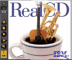
Here is the RealCD user interface, that is, about all that most users will likely see. There is a great deal more to it, such as the list of songs contained on the CD, and the "Help Book", as IBM prefers to call it, which explains how to use the application. The problem is, there is no indication from the main interface that these features exist, nor does the interface provide any clue as to how the user can access them.
Strangely, this is by design, and the IBM design team is quite proud of this fact: their main goal was to reduce all of the "clutter" created by standard GUI controls. The end result of their efforts to reduce clutter is an interface in which 88% of the space is devoted to a logo, and the remaining 12% provides absolutely no direction to the user.

For the sake of clarity, we have removed the logo so that our readers can concentrate more on RealCD's controls (by the way, this is not possible with RealCD).
Aside from the standard CD player controls (play, stop, next track, and previous track) there are 3 additional controls on this panel. The Eject button might be identified to some users through the process of elimination, but became apparent to us only after we heard the CD-drawer open several seconds after an inadvertent mouse click.
Of the two remaining controls, the Exit Application control is perhaps the least intuitive control we have seen in a graphics user interface. We searched in vain for it, clicking on the control panel, the logo, right-clicking in various places, all to no avail. It was only after making note of the fact that this application was designed by IBM's User Interface and Architecture Design Group that we surmised that the green "light" might in fact be the means by which the user exits the application. Sadly, our assumption was correct. Clicking on a green light to exit an application is about as intuitive as clicking on the Start button to exit Windows95. The only good thing we can say about this particular aspect of the design is that it is so stupid and so counterintuitive, that once discovered, few users will ever forget it.
The remaining control is perhaps the most important control in RealCD, and true to the design team's tendencies, it bears the least resemblance to a control. It is the only means to access the "Help Book", and the only means to view the contents of the CD. This control is the "Open the CD Case Button", represented by the 2 gray squares.
RealCD does not provide a status bar nor tooltips to indicate the functions of the various controls, nor for that matter, to identify which screen objects are indeed controls (IBM considers such interface elements as "clutter"). Since the "Open the CD Case" control is so completely inapparent, our guess is that most new RealCD users will never realize that the application offers more than the basic playback functions.

If the RealCD user has been lucky enough to discover the "Open" button, he or she will be rewarded with an apparent doubling of the size of the application. While IBM has kept to their practice of removing the "clutter" of meaningful, standard controls, they decided to stick to their practice of devoting a huge amount of screen real estate to their logo.
When "opening" the CD, the user must be careful to make sure that the application is positioned toward the right-hand side of the screen. Like a "real" CD case, RealCD opens to the left. If the application is positioned toward the left-hand side of the screen before it is opened, the left-hand portion of the opened CD will be positioned off the screen. This again, is by design: despite its obvious usability problems, IBM's design group argues that keeping the "main" interface (a new concept in itself) stationary is preferable to moving the interface into a useful and usable location. (An even more bizarre problem related to this design strategy will be demonstrated below).
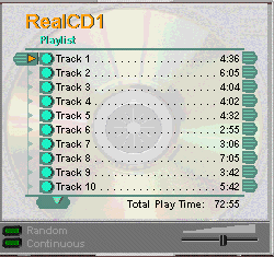
Opening the "case" provides access to the meat of the RealCD application: the list of songs on the CD, and also provides the conscientious developer a host of examples of how not to design an interface.

Actually, unlike the logo on the "unopened" case, the logo on the "opened" case is functional, although it will take some luck to discover it. The left-hand panel of the opened CD case contains the "Help Book", a design based apparently and sadly, on the liner notes of actual CD cases. Unfortunately, after overcoming the difficulty of opening the CD case itself, the user wishing to view the Help Book is faced with the difficulty of opening the Help Book. We tried the "standard Windows approach" (pressing the F1 function key) to no avail. We clicked on the right panel, we clicked on the left panel, we right-clicked on both, all to no avail. It was only after inadvertently moving the cursor toward the lower right-hand portion of the left panel that we noticed an animated page-corner graphic, indicating that something existed in the left panel of the case.
After clicking on the page-corner, the Help Book opens, thereby tripling the apparent size of the application from its original size. Unfortunately, the Help Book also opens to the left, so that the left-hand page of the Help Book is displayed off the screen, and is hence, not visible to the user (we're not kidding - this really has to be seen to be truly appreciated). The only way to see the Help Book is to physically move it into view, but since IBM considers such essential GUI controls as title bars to be unnecessary clutter, there is no apparent way to move the Help Book.
Since we had previously used IBM's "Real" applications, we were already familiar with IBM's special technique of moving windows. We started to move the app to the right so that we could see the entire Help Book, and quickly learned that the Help Book is a separate application. This was somewhat disconcerting, but not all that bad, until we stopped moving it. We had the misfortune to stop dragging the Help window when it was over the RealCD window, which, get this, closes the Help Book! To successfully view the Help Book, the user has to move the RealCD application to the right, so that there would be enough room to display both sections of the Help Book, or be certain that the cursor was not over the left-pane of the CD case at the time of dropping the Help Book. The User Interface and Architecture Design Group at IBM thinks this is a good thing. We consider it absurdly stupid, completely non-intuitive, and incredibly difficult to use.
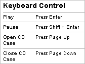
IBM did provide keyboard access to some of the features of RealCD. Unfortunately, they hid the description of the keyboard commands on page 12 of the Help file (a small portion of which is displayed here).
One of the advantages of standard Windows controls (those that the UI&A Design group at IBM so loudly disdains) is that they provide explicit instructions for keyboard access. For example, all controls (should) have mnemonic characters (the underlined letter) assigned to them, and menu items often have a keyboard shortcut (e.g., CTRL+P) to the right of the name of the item. While all users benefit from this information, IBM considers it "clutter", and chose to hide it in the Help file, thereby requiring those users lucky enough to find it to memorize the information in order to utilize it. This is quite simply, poor design.
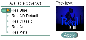
RealCD does have one useful feature to offer: the user can change the logo image. Unfortunately, this is accomplished not from within RealCD, but from within its Help file.
Let's restate the design: while you can change the title of the CD from within RealCD, and you can change the names of the tracks on that CD from within RealCD, you must invoke a different application to change the cover art to be associated with the CD.
The Cover Art function is described on page 14 of the Help Book, and the controls to perform the function are provided on page 15. While most designers might have provided a simple command button on the application to perform such a function, the "user-centered" designers at IBM decided it was more usable to require the user to:
This is a good thing? Hello?!

Continuing the design strategy introduced with the Cover Art function, IBM's designers provided some additional useful functionality in the Help Book. The user can specify whether or not RealCD should start automatically whenever a CD is loaded into the CD drive. Unfortunately, this setting is only available from page 17 in the Help Book.
Apparently, in their attempt to reduce the interface "clutter", RealCD's designers felt that the Help Book represented a welcome repository into which they could dump otherwise useful functions and controls. While most conscientious designers are trying to make Help files unnecessary, IBM seems bent on making them required reading.
If RealCD were just another shareware application we probably would not have taken much notice of it, and we certainly would not have devoted the time and attention to it we have here. What most captured our attention about the application was IBM's shameless promotion of the application's usability. In addition to the proclamations of "state of the art" and "intuitive" design, IBM promoted the design through white papers touting their design philosophy and the merits of "real-world" design, while also pointedly mocking the established design principles that have made computers accessible to millions of users.
As to the benefits of IBM's "real-world" design, let's get real: an application modeled after a plastic CD case?! The basic premise of their philosophy is that users will transfer their knowledge of the real-world counterpart to the computer representation. Our challenge to IBM is as follows: what possible knowledge could a user transfer from a plastic CD case that could remotely help them to play CD's on his or her computer?
A plastic CD case is as it is for 2 reasons: (a) it is an inexpensive means to protect the CD, and (b) its compact design reduces shipping and transportation costs. The only aspect of the real CD case design that relates to usability is that the tracks are listed on the outside of the case, so that prospective buyers do not have to open the case to see which songs are contained on the CD. We find it sadly amusing that self-proclaimed design professionals dropped the only usability feature of real CD cases from the application modeled on them, and decided instead to hide the song list underneath a completely unnecessary cover.
There is a great deal more we could criticize about RealCD, and many of the issues raised in our review of IBM's RealPhone are equally relevant here. In that review, we wondered whether IBM's unfounded criticism of established design principles and standard controls arose from ignorance or arrogance. After having used their applications extensively, and after having read their promotional materials, we can confidently conclude that their design philosophy stems from an arrogant rejection of 20 years of research into graphical interface design, and a woefully misguided belief that being different is good.
The User Interface Architecture and Design Group packages each of their applications with an extensive usability questionnaire (surprisingly, the questionnaire provided more information about available features in RealCD than the application itself). We find it interesting that IBM has been soliciting input from users of these apps for several years, but has yet to summarize the input they have received. We think the reason for their reluctance is aptly summarized in a line from a Bob Dylan tune: "...you don't need a weatherman to know which way the wind blows". If IBM's designers were to spend their time in a sincere effort to improve their interfaces rather than an insincere effort to rationalize the non-usability of their interfaces, the direction of the wind would have been instantly known.
We welcome your comments.
 Visitor Comments...