
Amid much fanfare, Apple recently released a beta version of the QuickTime 4.0 Player. Intended to showcase the technological improvements of the QuickTime 4.0 multimedia technology, the QuickTime 4.0 Player sports a completely redesigned user interface. The new interface represents an almost violent departure from the long established standards that have been the hallmark of Apple software. Ease of Use has always been paramount to Apple, but after exploring the QuickTime 4.0 Player, the rationale behind Apple's recent "Think Different" advertising campaign is now clear.
While there are some who would conclude that the revised interface represents innovative thinking at Apple, we would have to conclude otherwise. There is nothing innovative about the user interface of the QuickTime 4.0 Player; the developers adopted the same misguided principles employed in IBM's RealThings, copied some of the same features we critiqued in our reviews of IBM's RealPhone and RealCD, and added a few new follies of their own.
We recognize that some visitors may disagree with our assessment of particular features of the application and we invite your feedback. Comments can be sent to quicktime@iarchitect.com.
For the sake of accuracy, it should be noted that the following is a review of the user interface of the QuickTime 4.0 Player, not the QuickTime technology itself.
Inducted 25-May-1999
Related Articles
One look at QuickTime 4.0 Player and one must wonder whether Apple, arguably the most zealous defender of consistency in user interface design, has abandoned its twenty-year effort to champion interface standards. As with IBM's RealThings, it would seem that appearance has taken precedence to the basic principles of graphical interface design. In an effort to achieve what some consider to be a more modern appearance, Apple has removed the very interface clues and subtleties that allowed us to learn how to use GUI in the first place. Window borders, title bars, window management controls, meaningful control labels, state indicators, focus indicators, default control indicators, and discernible keyboard access mechanisms are all gone. According to IBM's RealThings, and apparently to Apple, such items and the meaningful information they provide are merely "visual noise and clutter". While the graphical designer may be pleased with the result, the user is left in a state of confusion: unable to determine which objects are controls, which are available at any point in the interaction, how they are activated, where they may be located, and how basic functions can be performed.
The QuickTime 4.0 Player sports a consumer interface, designed so that it "looks like" a physical consumer product. Apologists for this design philosophy maintain that users will more readily be able to transfer their knowledge of real-world objects to the software. Unfortunately, the apologists fail to recognize that there are two likely consequences of this approach: (1) the user is unable to transfer his or her existing knowledge of computer interaction, and (2) the software becomes needlessly subject to the limitations of the physical device.
The decision to eschew the existing interface controls provided by the operating system creates a variety of problems. The decision not to provide a title bar, for example, resulted in the loss of the standard window management controls. Windows users will find the the player offers no visual indication as to how to move, minimize, or maximize the player window. Similarly, Mac users will find that the loss of the title bar necessarily means that they have lost the ability to use the Mac's WindowShade and Zoom features with the player. Because the player does not utlize the operating system's standard means of managing windows, the designers had to develop their own; as a consequence, the user cannot rely on the established system conventions to determine, for example, the active player window. A further consequence is that third-party software that relies on the standard window management functions of the operating system will not function appropriately with the QuickTime 4.0 Player. App|Windows, for example, a Mac control panel that creates a navigation menu based on the titles of applications and any child windows each contains, cannot extract the names of open QuickTime Player windows.

The QuickTime 4.0 Player contains many examples of how the software must adopt the limitations of the physical device it is based on, but the first example the user is likely to discover is the volume control. Since a real-world hand-held electronic device typically employs a thumbwheel to control the volume, the designers concluded that it would work just as well in a software application. What the designers failed to realize is that a thumbwheel is designed to be operated by a thumb, not a mouse. Watching new users try to adjust the volume can be a painful experience. The user invariably tries to carefully place the cursor at the bottom of the exposed portion of the control, then drags it to the top of the control and releases, then carefully positions the cursor again at the bottom of the control, drags upward, and well, you get the picture.
The thumbwheel is the control of choice for physical hand-held devices for a variety of reasons: it functions in direct relation to the potentiometer used to vary the electrical signal, it is inexpensive, it is unobtrusive and unlikely to get snagged on other objects, and it responds well to a simple move of the thumb. None of these reasons relate to the interaction between a user and an image on the screen. It was selected merely to mimic the appearance of the physical device, and in this case, was a poor selection for the human-computer interface.
At some point, the designers realized their error, and therefore added other means by which to adjust the volume. The user can click the player just about anywhere near the thumbwheel and drag the mouse in any direction to control the volume. Unfortunately, there is no visual indication that this is possible, thus, it will be learned only through accidental discovery, or by learning it from somewhere other than the interface. The designers could just as well have placed a star anywhere on the interface and included a statement in the documentation to the effect: "Click and drag anywhere near the star to change the volume." The user is expected to make linear movements to operate a rotary control. This is the reason that most properly-designed applications utilize linear slide controls for similar functions.
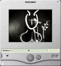
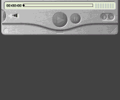
Another example of the inappropriateness of applying characteristics of physical devices to the design of software is the very size of the player. The image above illustrates the size of the player as it appears using the default size of the movie window for the selected movie. As seen in the image, the QuickTime 4.0 Player appears as though it might fit very comfortably in one's hand. That would probably be an important requirement for a hand-held device, however, this is not a hand-held device; it is a piece of software, one that must coexist with other pieces of software. The design results in an extraordinary waste of screen space. In effect, the designers have replaced the "visual noise and clutter" of useful controls with white noise: blank space that interferes with the user's ability to view and access other information on the screen, and as will be shown later, with the user's ability to interact with the player itself.
Perhaps in an effort to emulate the design of a real-world device or to avoid potential color clashes with any of the available colors for iMacs, the designers decided to give the player a brushed-metal appearance with dark gray controls and a pale yellow progress meter. If that particular color combination does not appeal to you, too bad; the designers of the QuickTime 4.0 Player were only concerned with their aethestic sense, not yours. Windows users will discover that the application ignores the user's preferred color settings, and does not provide a means for the user to specify his or her preferences. Similarly, Mac users will find that the program does not respond to changes made through the Appearance Manager. The designers did in fact adopt the user's color preferences for the transient secondary dialogs, but not for the omnipresent player window. Fortunately, the designers did not prefer purple buttons against a hot pink background, or diamond-plate to brushed metal.
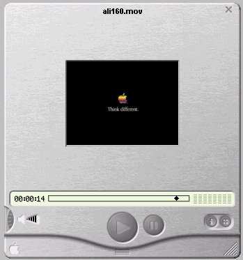
The color scheme of the QuickTime 4.0 Player not only represents a complete disregard for the user's color preferences, but the particular scheme selected leads to a number of important interface problems. Most notably, all of the controls appear to be unavailable. In a properly designed application, muted colors are used to provide a disabled appearance to any controls that are unavailable at a given point in the interaction. The designers made no effort to distinguish between controls that are available and those that are not. As shown below, the image on the left was captured before a movie had been loaded, and the image on the right was captured after a movie had been loaded (or was it the other way around?). The Play button is available in one scenario but not the other. Unfortunately, the designers felt that providing subtle cues to guide the user's interaction would have amounted to "visual noise." The designers were apparently unaware of one of the basic rules of GUI design: A GUI should provide GUIdance.


The designers were not unaware of the information that subtle color change can provide; they just seem to employ such changes at curious times. This image illustrates the appearance of the Play button after it has been clicked and released, that is, while a movie is playing. The change reflects two possible intentions of the designers: (a) they wanted to let the user know which button had been clicked, or (b) they wanted to let the user know that a movie is currently playing. Whatever their intention might have been, the net effect is that the Play button now appears enabled, while the Stop button appears disabled. The designers have the means to provide control state information to the user; they just need some direction in when that information should be provided.
Curiously, a different color change is occasionally used in the QuickTime Player to indicate the post-click state of other controls. For example, after the user has opened the "Advanced Controls Panel," the controlling button (in the upper right-hand area of the image) takes on a darker appearance, presumably to indicate that the panel is open. We would have thought that the very appearance of the panel itself would be sufficient to indicate that the panel is ... open.

Based in part on the selected color scheme, the user cannot distinguish between actual controls and incidental images. None of the standard affordances are provided to indicate which objects on the screen are indeed controls. Moreover, certain controls have the exact same visual characteristics as incidental graphics. There is nothing about the image of the speaker, for example, to indicate that clicking on it will have some effect; nor is there anything about the Apple logo to indicate that clicking on it will not have an effect. Such distinctions would have interfered with the designers' sense of aethetics.
The color scheme dictated by the designers has one additional potential consequence that should not be ignored. Because of the lack of contrast between the gray symbols and gray backgrounds of the controls, it can be reasonably expected that certain users will have difficulty locating a control of interest. Older users, and those with even slight visual difficulties will be needlessly disadvantaged when using the software. Those designers that might want to emulate the buttons used on the QuickTime Player would be well advised to consider this fact of human vision: the amount of light that passes through the eye of a sixty year-old is only one-third of that passing through the eye of a twenty year-old. The lack of contrast in the player controls will necessarily mean that many older users will be unable to discern the symbols.
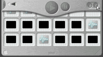
As part of their effort to mimic the appearance of the hand-held consumer device, the designers of the QuickTime 4.0 Player employed "drawer-like" interface elements. The most notable of these, and unquestionably the single biggest blunder in the design of the application (other than attempting to mimic a physical device) is the Favorites Drawer. The Favorites Drawer is intended to provide the user rapid access to his or her favorite multimedia files. By that concept alone, it should be a useful interface feature. Unfortunately, by virtue of attempting to mimic real-world devices, and due to a complete lack of familiarity with basic design principles, the Favorites Drawer in QuickTime is a dismal failure.
The designers provided a smooth animation to give the appearance of the drawer opening at the bottom of the device, much like, one supposes, a panel might open on a hand-held device, and very much like the phone number "drawer" used in IBM's RealPhone. The drawer demonstrates one distinct problem of translating real-world phenomena to the computer desktop: real-world phenomena are not subject to the constraints of screen size. The extent to which the drawer can "open", and therefore the number of items visible in the drawer, is a function of where the player is located in relation to the bottom of the screen. If you want to hold more than a few items in the drawer, you'll have to first position the player near the top of the screen. If you want to hold a lot of items in the drawer, you'll have to increase the resolution of your monitor. If the player is positioned too close to the bottom of the screen, the drawer will simply not open.
Similarly, the current size of the player can interfere with the user's ability to access items in the Favorites Drawer; if the size of the player is increased, there is less screen real estate into which the drawer can open and therefore, fewer items in the drawer are accessible. These problems would not exist if the designers had employed a standard pop-up window to contain the user's favorites. These problems are the direct, expected results of dogmatic adherence to a faulty design philosophy. By restricting themselves to the real-world metaphor, and not availing themselves of the dynamic features that computers provide, the designers needlessly restricted the utility and usability of the software.
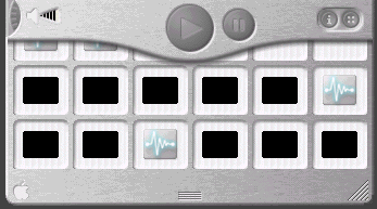
A look at the arrangement of items in the drawers demonstrates another fundamental problem with the translation of physical devices to software. The favorites are arranged in a matrix, the number of elements of which is limited by the size of the screen. A physical item is limited by its physical size. A virtual item, such as a list of phone-numbers or favorites, is limited only by the amount of computer memory. If the designers had provided a standard list box there would be virtually no limit to the number of favorites that a user could maintain. Furthermore, by availing themselves of other standard GUI elements, the designers could have provided a great deal of additional functionality such as organizing favorites by whatever constructs the user wishes to employ, or creating a PlayList of items to be played successively. Computer software is the ideal platform on which to offer such functionality, but because of their adherence to the physical device, the designers of the QuickTime 4.0 Player, like other RealThings apologists, have made their software woefully inept in an area in which it should greatly excel.
The images in the Favorites Drawer, despite their appearance, are not entirely meaningless. The QuickTime 4.0 Player assigns an image to those items that represent sound files. All sound files however, will be assigned the same image, and the program provides no means by which the user can substitute a meaningful image. On the other hand, the image used to represent a given movie is a thumbnail image of the first frame of the movie. On the surface, this may seem appropriate, until one looks at a collection of movies: most of the movies we downloaded, especially those from Apple, begin with a blank, black screen. The first frame of the remainining movies constituted a copyright notice which is especially unrecognizeable when reduced to thumbnail size. What were they thinking?
The images in the drawer indicate little more than the fact that the drawer contains items. For some completely inexplicable reason, the designers did not feel that it was important to display a title or other description of the item itself, nor did the designers provide any secondary means in the drawer itself, such as tooltips, balloon help, or a message in a status bar to distinguish various titles. This is not a result of the inappropriate application of a real-world metaphor; this is simply pitiful design. Balloon Help would certainly help the user, but it would still require the user to pass the cursor over each image until the desired target could be located. Since Balloon Help requires intervention of the user to be effective, it should be regarded as little more than a quick fix and not a substitute for an appropriate design of the Favorites function.
The lack of meaningful descriptions for the items forces the user to rely on the physical position of the item in the matrix. Unfortunately, if the user resizes the player window, the number of images in each row of the drawer may or may not change. The end result is that the user can no longer rely on image position as an aid to identification. An item that was the third row from the bottom, might, after resizing, appear in the second row. Because of the lack of labels and reliable positioning information, selecting a particular movie or sound file from the favorites drawer is not unlike trying to find a caramel-filled chocolate from a sampler box of chocolates. As expressed by Forest Gump in the movie bearing his name:
The only reliable means of finding a particular type of chocolate is to either bite into each, or at least press your thumb into the bottom of each and hope that nobody notices later. Similarly, the only reliable means with which the user can identify a file of choice in the favorites drawer is to open several until he or she happens upon the file of interest. If the designers had been concerned with the users' objectives at this point of the interaction with the QuickTime 4.0 Player, specifically, the ability to rapidly locate and open a particular file of interest, the favorites drawer would never have seen the light of day. Unfortunately, the designers were far more interested in form over function, where "looking good" is considered more important than working well.
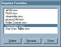
The application does provide additional means to determine the names of one's favorite media files, but the user must go somewhere else. The application's menu bar offers a function labelled "Organize Favorites", which when selected provides a standard listbox containing the names of the favorites. The listbox allows the user to rename favorites, delete favorites from the list, and reorder items in the list; these functions are notably unavailable from the Favorites Drawer itself. The Organize Favorites dialog is not without its own design problems. Surprisingly, the Organize Favorites dialog does not allow the user to Add favorites to the list, for that, the user has to ...go somewhere else. Items in the list can be reordered, but no indication is provided that this is possible. Further, as an example of a failure to pay attention in GUI 101, the designers do not allow the user to make multiple selections in the listbox; you cannot delete more than one item at a time, nor move more than one item at a time. (Additional design inadequacies of the dialog are discussed below).
Those limitations aside, all the designers need to do is add the ability to launch a favorite from the Organize Favorites dialog, change the title of the dialog to "Favorites", and burn the source code for the drawer. In so doing, they will exponentially improve the utility and usability of the Favorites function. Then, after the designers complete GUI 201, they might want to provide the user the ability to organize the favorites into categories, export groups of favorites to share with others, add the ability to create a playlist, and open a favorite in a new window. When you are dealing with a computer and not a real-world physical device just about anything is possible.
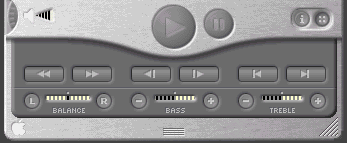
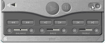
A second interface drawer is used to hold (and hide) the "Advanced" controls. These include the balance, bass and treble audio controls, and the video navigation controls. A similar animation, smoother than that of the Favorites Drawer is used to give the appearance of the panel opening at the bottom of the device. Unlike the Favorites Drawer, which will not open if the player is positioned too close to the bottom of the screen, the Advanced Controls Panel will open beneath the visible portion of the screen, thereby requiring the user to perform some window manipulations to view and access the functions.
The position of the Advanced Controls Panel directly interferes with the Favorites drawer, often making it impossible to select favorites when the Advanced Control Panel is open. By selecting a design in which both panels "open" below the player, the two panels must compete for the same screen real estate. Further, attempts to view more of the Favorites Drawer when the Advanced Controls Panel is open can cause both panels to be closed. If the designers had employed a standard pop-up window for one or both of the panels, neither would of necessity interfere with the other.
The design of the Advanced Controls Panel suffers from a number of basic design problems, the most notable of which is how the user accesses it. Whereas the Favorites Drawer is accessed by dragging or double-clicking the "thumb indentation" on the player, the Advanced Controls Panel is opened by single-clicking the button-that-looks-like-a-shirt-button (there's a real-world metaphor for you). The image on the button has no resemblence to its function, nor to the functions contained on the panel. Furthermore, since QuickTime, like IBM's RealCD, does not provide tooltips (or balloon help) for any of its controls, the interface provides no indication that the functions exist.
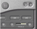
While the Advanced Controls Panel is aesthetically clean and appealing, the arrangement of controls is likely to lead to mistakes in their operation. Because the designers balanced three sets of video controls directly above three sets of audio controls, because all of the video controls resemble arrows, and because the video buttons are several times larger than the audio buttons, it is reasonable to expect that some users will click on a video control in an attempt to change the setting of the audio display directly beneath it. While the consequences of such errors are minimal for a multimedia player, in terms of design principles, this would not be a desirable arrangement to follow for software in which such errors could lead to more serious consequences.
While hiding these controls on a panel does result in a leaner, cleaner interface for the main player, it is likely that some users would prefer that the controls always be present and available. The video controls in particular are, after all, standard multimedia controls, and hiding such basic controls as fast forward and reverse for the sake of a "clean" player interface strikes us as a mistaken design priority. One solution would have been to allow the user to indicate that the Advanced Controls Panel be kept open; unfortunately, the program offers no such option, nor does it remember the state of the panel between sessions.
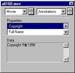
The interface offers a third drawer, opening into the same location as the others. The Information Drawer contains some information for the currently loaded movie. Like the Advanced Controls Panel, the user's access to the Information Drawer is restricted by the location and size of the player. If the player is positioned too low on the screen, if the user is currently viewing a large movie, or if the user has resized the player to a large size, the Information Drawer cannot be accessed. In a true example of the nature of competing screen real estate, if the user accesses the Information Drawer while the Advanced Controls Panel is open, the player will close the Advanced Controls Panel before opening the Information Drawer. The net result of this competition for real estate is that the user cannot have both panels open at the same time. Moreover, the user will have to specifically re-open the Advanced Controls Panel to return the Player to the state it was in before opening the Information Drawer.
The same information provided in the Information Drawer is also provided somewhere else in the interface. The Get Info menu function displays a dialog containing a repeat of that information, and provides additional information as well. In fact, the Get Info dialog is the only place in the application where the user can discover the length of the currently selected movie (without of course, having to watch the movie or move to the end of the movie). Not only does the Get Info dialog provide more information, it does so without interfering in any way with the rest of the interface.
Unfortunately, the Get Info dialog is a complete UI aberration. Locating the same information as that contained on the Information Drawer will require scrolling through a three-item listbox (which only displays two lines at a time) and selecting the various options. At a minimum, this will require three additional mouseclicks. Locating additional information, such as the original size of the movie or its duration, will require an additional two mouseclicks each. Locating the format of the video track will require an additional four mouseclicks among two controls, and locating the sampling rate of the sound track will require additional manipulation of two controls for an additional four mouseclicks. The person responsible for creating this Rube Goldberg design could not have made the information more difficult to locate and access.
There are many additional interface problems that indicate a general lack of familiarity with the basic principles of user interface design. These problems, we believe, cannot be excused by the "beta" status assigned to the product. Apple, regarded by many as the definitive advocate of attention to the user interface, should be setting an example for other developers to follow, not relying on its users to identify user interface problems in its products. One characteristic of the QuickTime 4.0 Player that we found particularly striking was that the program is often stupid. It "forgets", for example, the user's specified volume, bass, treble, and balance settings. It cannot remember the state of the Advanced Controls Panel, and it cannot remember where a particular dialog had last been positioned. Providing an application a means of recall is standard practice in the software industry; the failure to provide such recall is more a reflection on the designers' backgrounds than on the beta status of the product. Additional such examples include the failure to allow multiple selections in lists, the failure to indicate the default command button when an item in a list is selected, the failure to allow the user to cancel changes in certain dialogs, the lack of keyboard navigation among controls on a dialog, the inconsistent application of standard controls rules, and the use of convoluted and inconsistent navigation paths through the application.
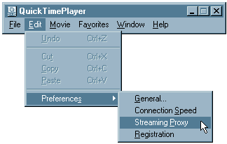
The user quickly discovers such problems when attempting to specify options within the player. The "QuickTime Settings" dialog, which is accessed by selecting (of all things) either Connection Speed, Streaming Proxy, or Registration from the Preferences submenu of the Edit menu, is particularly problematic. Each option takes the user to the same dialog, which offers a drop-down control containing many other categories of settings. While selection of most of the items in the drop-down control will cause the options related to that category to be displayed in the dialog, selecting one in particular causes an additional dialog to be opened. A separate preferences dialog, General Preferences, offers additional options and suffers fewer UI problems. The General Preferences dialog is accessed through the more straightforward means of selecting General from the Preferences submenu of the Edit menu. The fact that the program offers two separate options dialogs can possibly be attributed to the product's beta status. Hopefully, the QuickTime design team will place a call to someone in Apple's interface design group for a consultation on how the two dialogs can be combined into a single, properly designed and easily accessed dialog.
Perhaps one of the most shameful aspects of the program is that it does not come with its own help facility. Users in search of elementary help on the program, such as learning which combinations of keys must be selected to perform basic functions, or to learn which file types are supported, will first have to log onto the internet and access Apple's website. Once there, the user will have to learn how to navigate the web pages of the site, based on whatever navigation methodology might be in place on that particular day. Depending upon the user's internet connection, it might take several minutes simply to access the web page. In contrast, if the program had been properly supplied with its own help facility, the user, by leveraging his or her existing knowledge of how to use help, could locate the information much more efficiently.
While we can recognize that the software company might realize certain economic benefits by utilizing on-line help in lieu of local help, any such advantages are far outweighed by the disadvantage placed on the user.
On-line help should be considered an adjunct to a local help facility.
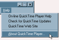
One area that can be expected to cause confusion is the use of two separate "About" dialogs. These typically include the version information for the program, copyright notices, and other such information. Selecting "About QuickTime Player..." from the Help menu causes one "About" dialog to be displayed; the other About Box is accessed by selecting "About QuickTime" from the drop-down box of categories on the QuickTime Settings dialog which is itself accessed by selecting either Connection Speed, Streaming Proxy, or Registration from the Preferences submenu of the Edit menu. While there is a logic behind the two About Boxes, the logic will not be apparent to those many users who will not notice the distinction between the titles "About QuickTime Player" and "About QuickTime". The typical user will not notice that there is a distinction between the player and the underlying system files that allow it to work. If it is necessary to provide both types of information, they should be provided within a single dialog, accessed from a single location in the application.
The design of the user interface in the QuickTime 4.0 Player could hardly be described as innovative. It merely represents the latest failure in a sporadic attempt to make computer software look more like real-world analogues. We have attempted to explain in this review, and in our earlier reviews of IBM's RealPhone and RealCD, why such attempts are misguided. While we acknowledge that Apple's use of a hand-held electronic device as a model is more appropriate than IBMs attempt to model a CD player application on a plastic CD case, we cannot ignore the fact that designing a multimedia viewer to look like a hand-held device is no less inappropriate than designing a personal information management application to look like a hand-held PDA. The model necessarily restricts the utility of the software. Additionally, we hope to have explained why the effort is particularly doomed to failure when the designer is either unfamiliar with the basic concepts relating to human-computer interaction, or chooses to ignore those concepts.
We find this trend toward "consumer" interfaces to be particularly disturbing. The design places a premium on aesthetics over usability. The emphasis is on creating a flashy product, and not on creating a useful and usable product. Rather than asking, "How can we make this look more like a real thing?", the designers would do their users a far more important service by asking, "How can we make this operate better than the real thing". To use the QuickTime 4.0 Player as an example, the designers spent far too much time making the software look like a hand-held player, and far too little time examining how they might add utility to such a player. A hand-held player is just that: a player. A software-based multimedia viewer can become an information device. It would appear that this latter approach was never considered in the design of QuickTime.
We should all be disturbed by this trend. Apple devotees should be enraged. Apple has amassed a dedicated following of users due, without question, to Apple's attention to the user interface. If the user interface of the QuickTime 4.0 Player is an indication of the future of GUI design at Apple, Apple's leadership should certainly be worried. Without that attention to the user interface, there is no real reason for a dedicated following among its users.
Our hope is that apologists for the real-world design philosophy will take a serious look at the limitations of their approach. It would seem that this approach has arisen from a belief that the current state of GUI design has stagnated, and that a radical design approach is necessary. The constancy of the desktop model might be explained in terms of the constancy of steering wheels and pedals in automobiles: they work very well.
We do not dispute that there is room for improvement and we do not wish to detract from any sincere effort to explore alternatives. Unfortunately, instead of investigating how current GUI design strategies might be improved, followers of the real-world approach have decided to completely abandon those strategies, and with them, the basic principles of design such as perceived affordance, feedback, guidance, and consistency. The attempts to follow this approach have demonstrated that they have indeed, thrown out the baby with the bathwater. We are struck by the consistency of failure exhibited in these attempts, and see several possible explanations for the failure rate: (a) it is being attempted by the wrong persons, (b) it is being attempted for the wrong reasons, or (c) a combination of both. We believe there is data to support each of these candidate explanations and another as well: designing virtual software in accordance to the requirements and characteristics of physical devices does not work.